
Geek Think: Housing Boom Phase Diagrams
Warning, this article may only be interesting to serious geeks. If you are not a geek, the DELETE button is on the upper right-hand corner of your keyboard.
I thought it would be useful to give you a more formal version of the home price analysis than I would put in a typical post.
As my old friends know, I am a big fan of making sure you distinguish between asset markets and flow markets when thinking about the economy. The reason is pretty simple. GDP is a number of about $27 trillion, chump change in comparison with our $481 trillion balance sheet, including $321 trillion in financial assets and $160 trillion in real estate and other tangible (George Carlin) stuff, according to the Fed’s most recent Fed Z1 report on the financial accounts of the United States.
Bottom line: if a policy does not impact the asset markets it does not matter for investors for the simple reason, they are so huge. This is like asking whether the earth orbits the sun or the other way around. We all know the sun is the big dog in this story, therefore the earth orbits the sun. Technically, this is not quite true. In fact, both the sun and the earth rotate the center of mass of the sun-earth system, which is a point inside the sun but not its center. The end.
This is important because almost all of what passes for macroeconomic analysis today is simply descriptions of who is spending how much money in the GDP accounts. That analysis leads these thinkers to make big mistakes, which gives us great opportunities to make money.
Regarding real estate, take a look at the following diagram.
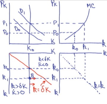
In this diagram, the graph on the upper left represents the asset market in which the price P of the existing housing stock, K, is determined.
The graph on the upper right represents the new construction (flow) market in which the price of an existing home interacts with the marginal costs of contractors to determine the number of homes or buildings they are willing to build, which we denote by lower-case k.
The lower right graph is simply a device for bringing big K and little k together on the same graph, which I have placed in the lower left. That is where all the action takes place.
Start with housing stock K(0) and demand for homes D(0) which determine the initial price of a house at P(0) in the upper left graph. A drop in interest rates increases the number of homes demanded at each price, creates an excess demand for homes, and pushes the price of an existing home up to P(1).
In the new construction market in the upper right graph, the higher home price results in more homes being built per year, k(1), than was the case at higher interest rates.
Now the hard part. The graph in the lower left is a phase diagram, a concept we can use to help think about dynamics. The critical concept is the stationary state line descending from the origin downward and to the right. That line represents combinations of K(t) and k(t) that leave the existing housing stock unchanged. This will happen when the construction of new homes, k(t), is just big enough to replace the number of homes that have worn out through depreciation (you know, like when your teen-agers come home). I have assumed that delta percent of existing homes wear out each year through depreciation. For example, if a home lasts 50 years, then delta would be 2% per year.
Assume we start at K(0) and k(0), which is a point on the line described above, i.e., we start in a situation where the housing stock is neither growing now shrinking. I can do this–it is my chart!
Now lower interest rates. The higher demand in the upper left graph increases the price to P(1), which increases housing construction in the upper right to k(1). But at k(1), we are building more houses than needed to replace the ones wearing out. Therefore, the housing stock is growing. In fact, a little thought and 2 glasses of wine will convince you that all the points downward and to the left of the line in the lower left graph represent situations of a growing housing stock. In fact, the vertical distance from the line indicates how fast the housing stock is rising or falling. Conversely, all points to the right of the line represent a shrinking housing stock. In this example, the housing stock will continue to grow until construction and depreciation are once more equal and the housing stock is in a new stationary state. (Geek note: Ludwig von Mises would have referred to such points as evenly rotating. Richard Dawkins would call them ESS, or evolutionary stable systems.)
A drop in interest rates will make a permanent increase in housing prices but, over time, the growing housing stock will mitigate some of the price and construction pressure, which means the initial burst of activity, and possibly of price, are likely to moderate somewhat over time. To an information theorist, the initial spike in price is a way of amplifying the initial information signal that housing is now scarce to get everybody’s attention, so they get out their hammers and build more houses.
So, interest-rate induced housing inflation is largely a one-time event. It is not property inflation. It is not a housing bubble.
Housing inflation, as opposed to one-time increases in home prices, happens when there is a continuous increase in demand caused, for example, by systematically inflationary monetary policy like we had during the Fed’s ZIRP period.
Housing bubbles pop when a sudden increase in interest rates, or a sudden reduction in the availability of mortgage financing, causes a sudden, one-time, drop in demand. That is exactly what happened over the past two years, making home prices too high for today’s interest rates.
Conclusion: There were good reasons why home prices increased during the COVID pandemic when people found checks from the government in their mailboxes and the Fed drove mortgage rates below 3%. But mortgage rates are over 7% now. Don’t get caught in the trap of believing that home prices will stay high forever. Prices are due for a decline next year.
Final geek note – I promise. The construct of present values, which underlies the construction of the stock demand curve in the upper left quadrant of our story, and we use all the time in finance, is weak stuff. Usually done by using “the” discount rate, a single number that is supposed to represent the opportunity cost of alternative assets during the life of the house. What we should use, instead, is estimates of the rental value of the house for each future year, each discounted by the relevant expected discount rate for that period, which you can approximate by calculating expected forward interest rates from adjacent bond yields. When the shapes of the cash flow streams we are analyzing (here determined by the choice of depreciation rate) are different from the shapes of the cash flows of the bond we are using to measure interest rates, this causes problems. Especially true for the housing stock, which has a duration longer than any government bond today.
Dr. John
The views and opinions expressed in this article are those of Dr. John Rutledge. Assumptions made in the analysis are not reflective of the position of any entity other than Dr. Rutledge’s. The information contained in this document does not constitute a solicitation, offer or recommendation to purchase or sell any particular security or investment product, or to engage in any particular strategy or in any transaction. You should not rely on any information contained herein in making a decision with respect to an investment. You should not construe the contents of this document as legal, business or tax advice and should consult with your own attorney, business advisor and tax advisor as to the legal, business, tax and related matters related hereto.