
Corrected April Inflation 1.9%

Corrected April inflation – CPI 1.9%, Core CPI 2.2%–is already at the Fed’s target. Next week’s PCE report will tell the same story.
Dr. John Rutledge
Chief Investment Strategist
Summary: This is your monthly update to remind you that the CPI is badly flawed, that it doesn’t mean what the Fed thinks it means, that inflation has already reached the Fed 2% target, and that they are probably going to sit on their hands, do nothing, and give a lot more self-aware speeches about how tough they are. I also remind you that:
- My corrected inflation index isn’t perfect either. It just fixes one glaring bias that is keeping rates too high, too long.
- There is no perfect index for measuring inflation (or anything else). Which inflation measure to use depends on why you are measuring it.
- If I were to design an inflation measure for the purpose of guiding Fed policy, I wouldn’t use consumer prices at all. GDP is mostly services that evaporate when you use them like popsicles on a warm day. Because you cannot hold them over time—their total return is -100%—they play no role in household, business, or investor portfolio decisions.
- Monetary policy works by creating arbitrage opportunities—gaps between the after-tax total return (income plus service value, plus expected capital gains) on real assets like houses, cars, boats, airplanes, factories and machines, and the after-tax total return (income plus expected capital gain) on financial assets like stocks, bonds, money market funds.
- I would use real asset prices to build my price index because the inflation rate of real assets is a measure of the capital gains yield on people’s holdings of tangible assets, the largest asset class and the components of net worth.
Corrected April CPI
Official price indexes have done a terrible job measuring inflation during the post-COVID period. As I explained in my last post, the Consumer Price Index (CPI) under-reported inflation on its way up, between May, 2020 and June, 2022 and over-reported inflation on its way down, every month since then. April was no exception.
According to the official report, the All-items Consumer Price Index (CPI)—often referred to as Headline Inflation—increased by 3.4% in the 12 months ending in April. The corrected CPI, calculated by excluding so-called Owners’ Equivalent Rent (OER) from the index, increased by only 1.9%, just below the Fed’s announced 2% target, as shown below in Figure 1.
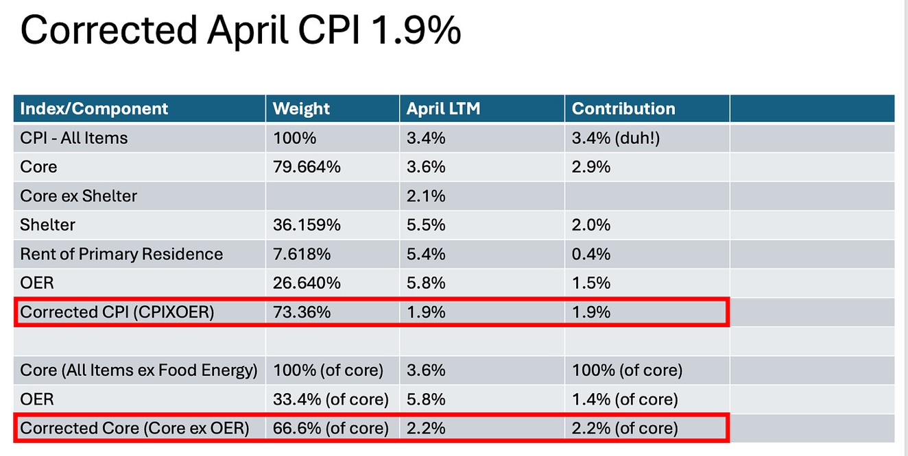
Figure 1 Corrected April CPI 1.9%
The first 6 rows in Figure 1 contain data taken from Table 7 in the April CPI report. The columns show 1) selected sub-components of the CPI, 2) the sub-component’s weight in the market basket used to calculate the All-items CPI, 3) its increase over the previous twelve months, and 4) its contribution to the 3.4% reported for the All-items index.
For example, Rent of Primary Residence in row 5, which measures actual rent checks paid to actual landlords by actual people who actually rent their place of residence from someone else, makes up just 7.618% of the All-items market basket, increased by 5.4% over the previous 12 months, and contributed 0.4% to the headline inflation rate. In comparison, OER, shown in row 6, has a whopping 26.640% weight in the All-items index, increased by 5.8% during the 12 months ending in April, and was responsible for more than half (1.9%) of the 3.4% headline inflation.
In the 7th row—the row with the red box around it—I used these figures to construct a corrected April inflation number (CPIXOER) by excluding OER from the market basket. The remaining 73.36% of the All-items market basket increased by just 1.9% over the 12 months ending in April, slightly below the Fed’s much-advertised 2% inflation target, where it has been for most of the past year.
Using similar logic, I have made the same calculation to construct a corrected Core (All items excluding food and energy) inflation number using the figures in the red box at the bottom of Figure 1. Corrected Core inflation for the 12 months ending in April was 2.2%.
So much for the numbers.
So, why is OER in the index anyway?
The honest answer, as I have written before, is I don’t know because having it in the CPI market basket used to construct the index makes no sense at all. The BLS describes the CPI as a measure of out-of-pocket inflation, as opposed to the broader PCE, which includes non-cash items like employer-paid insurance. But OER is definitely NOT an out-of-pocket expense because it does not represent any transactions at all (no checkbooks were taken out of any pockets in the making of OER).
The best I can do is to say that OER was baked into the national income (GDP) accounts long ago by agreement with other OECD countries in a misguided attempt to twist GDP into a measure economic welfare, rather than a measure of currently produced output of goods and services, which is what the textbooks pretend it is. So they invented OER—imaginary rent—in an attempt to measure the economic value of living in your own house. Unfortunately, the roughly $2 trillion of OER built into this year’s GDP accounts overstates GDP, personal consumption, and personal income statistics and distorts disposable income, per capita income, and savings rates compared to what people actually see on their pay stubs or in their checkbooks.
While it is certainly true that homeowners enjoy living in their homes—I am enjoying living in mine right now as I write this post—that enjoyment has nothing to do with the current economic activity and does not, in any way, represent an expense to the consumer. For example, by owning my house, financed by the 2.375% fixed-rate mortgage I snagged during the last QE episode, rather than renting a house from another person, I have effectively hedged (pre-purchased) all the housing services I will ever need for a fixed annual fee, no matter what happens to market rents. That’s no different than if I had filled my garage with a lifetime supply of paper towels and would never have to worry about paper towel prices again.
As I wrote in my last post, the practical reason to correct the overweighting of rent in the CPI is because rent followed a distinctly different path from other prices during and after COVID. In normal times, when rent and other prices track closely, failing to make the OER correction wouldn’t have much of an effect on the CPI so would not be likely to mislead the Fed into making another policy error. Not so today.
So, what’s the right price index?
Sorry to be a Debbie-downer but if you’re wondering if the corrected CPI we worked so hard to calculate is the “right” inflation metric, the answer is no. I’m comfortable that, for the Fed’s purposes, it is more useful than the official numbers but there is no such thing as the “right” inflation index.
When people ask me what is the right way to measure anything, I always tell them it depends on why they are trying to measure it in the first place. That’s especially true for prices because there are so many different ways to put together an index.
If your purpose for measuring inflation is to measure how difficult it is for people to make ends meet, for example, you would want to include all the things people usually buy, which is what a cash-based CPI tries to measure. If you are trying to measure inflation because you believe that inflation has a big impact on jobs and unemployment and therefore on people’s incomes, however, you might choose the index that is most closely correlated with employment.
The Right Index for the Fed to Watch
If you are the Fed, however, and your purpose is to improve long-term growth and living standards, I would advise you to measure inflation with a very different index that measures the annual rate of increase in tangible asset prices, both because that is what you ultimately control and that is what drives major changes in the capital markets.
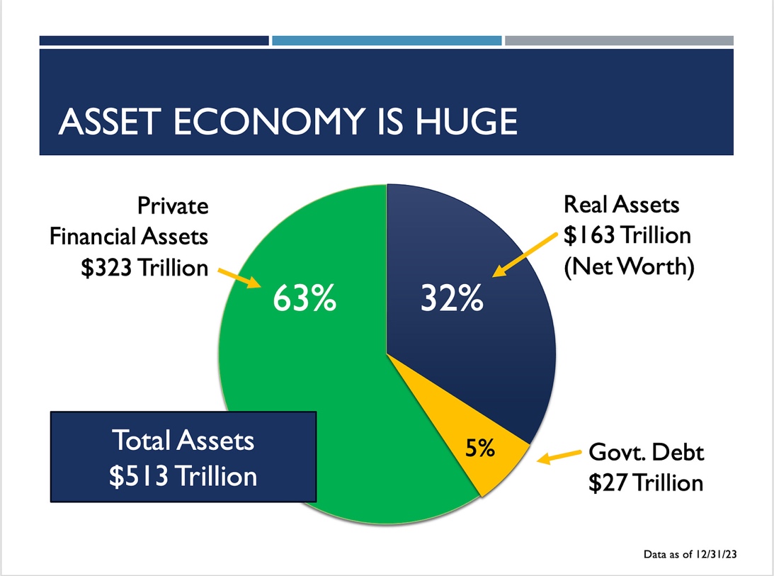
Figure 2: U.S. Total Assets
As I have written at length in previous posts, tangible asset inflation measures the capital gains component of the after-tax total return on the $163 trillion of real assets in Figure 2 that people in the U.S. hold on their $513 trillion balance sheet. By artificially driving the total return on real assets up (rising inflation), or down (falling inflation), the Fed sets up incentives for people to undertake multi trillion-dollar waves of portfolio rebalancing. Those tidal waves of rebalancing play havoc with the financial markets and the banking system and impedes capital formation, the real source of rising living standards over time.
Dr. John
The views and opinions expressed in this article are those of Dr. John Rutledge. Assumptions made in the analysis are not reflective of the position of any entity other than Dr. Rutledge’s. The information contained in this document does not constitute a solicitation, offer or recommendation to purchase or sell any particular security or investment product, or to engage in any particular strategy or in any transaction. You should not rely on any information contained herein in making a decision with respect to an investment. You should not construe the contents of this document as legal, business or tax advice and should consult with your own attorney, business advisor and tax advisor as to the legal, business, tax and related matters related hereto.