Summary: Advice I would give Kevin Warsh before his first FOMC press conference:
Everyone knows about Stanley Milgram’s Small World research showing that every actor in Hollywood is, at most, six other actors removed from Kevin Bacon. The question of the day is how many degrees you are removed from Kevin Warsh.
On a personal note, I can claim to be only one degree from Kevin Warsh with almost a straight face. I met him in 2002 when he propped me up to do a press conference on the White House lawn on the impact of W’s proposed dividend tax cut on the stock market. But I know that the average cell in the human body only lives for seven years, which gives it a 3.5 year half-life. That makes 2002 7 half-lives ago, which means only 0.78% of Kevin’s and my current cells were actually there at the time. Truth is, I’m probably a 2 or 3, which means it would take 1 or 2 phone calls to make arrangements to reintroduce the rest of our cells over lunch. If you like the advice I have for Chairman Warsh forward this post to a friend who can forward it to someone who can forward it to Kevin and we can run our own small world experiment. If you don’t like it then, well, don’t send it.
What everyone is worried about, of course, is that Kevin Warsh is only one degree from President Trump, who has made it clear that lower interest rates would make him very happy. There is ample reason to worry, both because the families are close and because the independence of the Fed is so important. But I, for one, think there is a good chance Kevin will surprise us and focus on controlling inflation. I should disclose, however, that I do have a certain amount of gold, copper, natural gas, pipelines, infrastructure, and real estate in my personal portfolio just in case I’m wrong.
In the summary, I told you that May inflation was higher than the number you saw in the newspapers. I’ll explain why below and write more on the other bullet points in a later post.
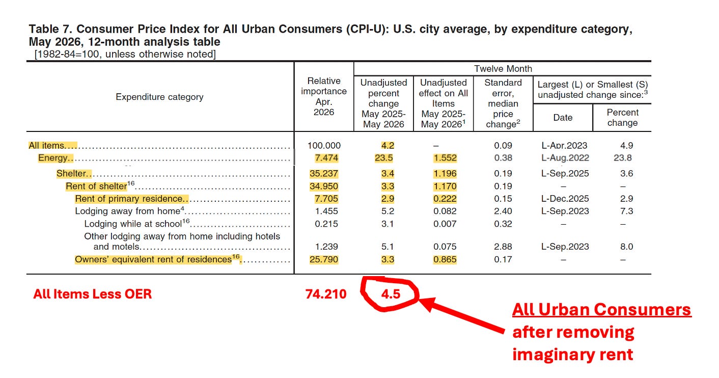
Last week’s CPI report told us that the consumer prices in May had increased 4.2% over the past twelve months. As I have written before, however, there is a serious flaw in the structure of the market basket of goods used to measure the CPI. The problem is a completely made-up number known as Owners’ Equivalent Rent (OER) that dramatically overstates the impact of housing costs on the CPI.
As shown in Figure 1, above, the May CPI report showed 4.2% headline (all items) inflation over the previous 12 months. The elephant in the index is always housing costs because Rent of Shelter has a 34.950% weight in the overall index. In the footnotes, you will see that Rent of Primary Shelter—real checks paid by real renters to real landlords—only makes up 7.7% of the index. In comparison, Owners’ Equivalent Rent of Residences accounts for 25.8% of the index. What, exactly, does OER measure?
If you dig through enough footnotes, you will conclude, as I did, that OER is a measure of nothing and should be removed from the index. It purports to measure what the two-thirds of American households who own their own homes—40% of whom own their homes free and clear with no mortgage—would have had to pay for rent if they were to rent their own house from themself. In practice, the data wizards have to invent a number for OER from whole cloth because there is no economic exchange to measure. They do this by starting with the rent paid for actual nearby rented apartments, which are adjusted upwards to account for t for sure footage differences, etc. The net result is to make the weight of apartment rents in the overall CPI about 4x bigger than it should be.
Why does this matter? Because rent can grow at a significantly higher, or lower, rate than the rest of the index for extended periods of time, warping the information in the CPI. For various reasons, rent today is growing more slowly than other prices, so OER bias pulls the reported number down. In Figure 1, May inflation, after correcting for OER bias by removing OER from the index is 4.5%, not 4.2% in the official report. In a previous post, I showed that OER bias forced the CPI to under-state inflation in 2021-23, and overstate inflation in 2024-2025, leading to serious policy errors win both cases.
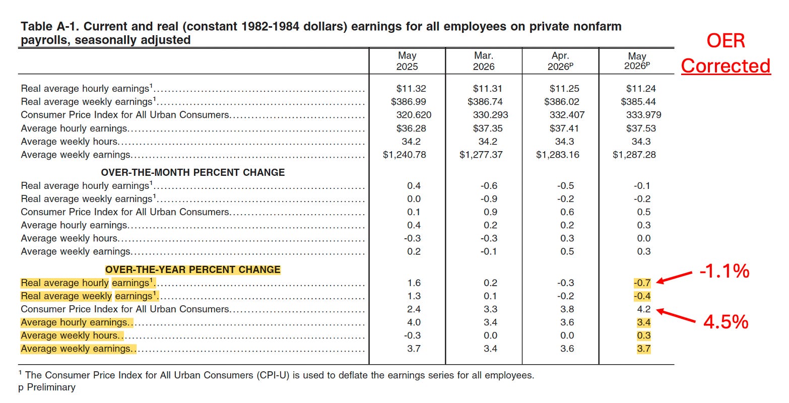
But the same OER bias also pollutes the data on income and earning, as we will see below.
Figure 2, above, uses data from last week’s May Real Earnings report to show the impact of OER bias on real earnings for all employees on private payrolls. Using the corrected CPI (4.5%), reduces real average hourly earnings from (-0.7%) to (-1.1%).
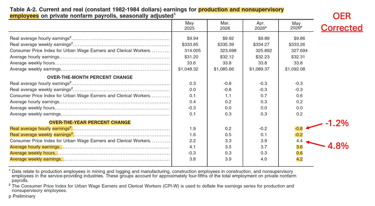
Data in the Real Earnings report allows us to zero in on whose hourly earnings are falling. Figure 3 shows that production and nonsupervisory (blue collar) employees experienced higher inflation and a bigger drop in real hourly earnings than we saw in Figure 2 for all employees. Correcting the CPI Figure for OER bias shows that blue collar workers in May experienced 4.8% inflation and a (-1.2%) drop in hourly earnings.
If the White House knew all this, of course, there would be a lot more late-night tweets about reducing interest rates. I’m not going to tell them.
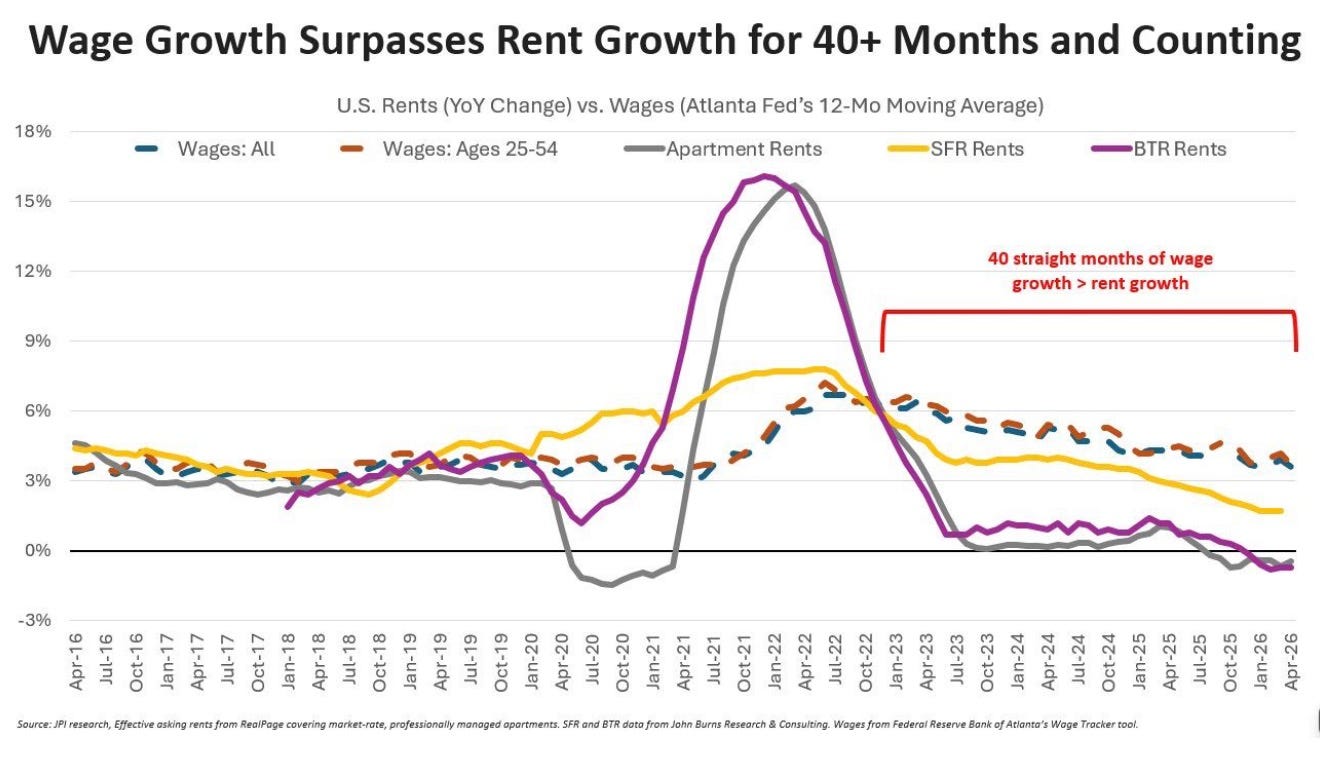
Figure 4, above shows that the problems in the May CPI report are going to pollute the next several CPI reports in the same manner, resulting in artificially low reported inflation figures, because rents are now rising more slowly than other prices. These artificially low reported CPI numbers will make Kevin’s trips to the podium for the rest of the year a little easier than they deserve to be.